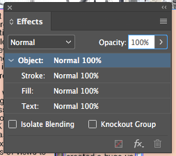
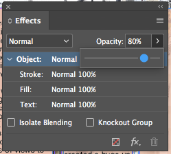
Through looking at past double page spreads, often the text boxes were transparent in order to still see the main image, as well as read the text.
I wanted to know how to do this and see what my double page spread would look like with this effect. In order to do so, I needed to research it.
The answer straight away came up on google.
I then tried it on my text box.
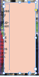
Below is the text box with 100% capacity.
Below is the text box with 80% capacity.
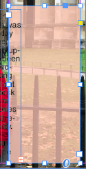
I quite liked this effect as it not only followed codes and conventions of a double page spread, but it also showed more creativity by still being able to see the main image.
Subscribe to:
Post Comments (Atom)
My Chosen Brief
7. An extract from an original documentary TV programme, lasting approximately five minutes, together with two of the following three opti...
-
The first arrow is where I believe my AS product, an R&B music magazine, would be positioned (at the lower end of the 'hits' se...
-
I have decided to change my documentary quite a lot. I have changed my central location to Westminster, London. This makes more sense due t...
-
Advanced Portfolio from grace page on Vimeo . This is my second documentary draft after making some large changes. I now have a new pr...
No comments:
Post a Comment