Tuesday, 12 December 2017

Research - Audience Feedback Questionnaire 2

This questionnaire was a wider audience feedback. It was sent to members of my focus group, both young adults and middle aged people, and then sent out further to this broad range of ages. This is because I need varied thoughts from various different age groups who my documentary is targeted at.

1) I first asked this question as it is essentially the most important thing to achieve throughout audience feedback. I wanted to make sure the improvements I had made were right and effective.


I was very happy with this response as it meant that I had made the correct improvements and 100% of respondents preferred my improved documentary.


2) I then wanted to make sure it was noticeable that I had added more information about the election, as 21.1% of people said they felt they received very little information about it.


I was very happy that no one said they did not receive any information about the election, and only 33.3% said they thought they obtained little information, with a 66.7% majority saying they did obtain enough information. This is a good improvement.


3) In my previous questionnaire, 11.1% of people said that they did not realise that my extract was from the beginning of my documentary. I therefore made alterations by adding a Channel 4 title screen to make it more obvious.


This alteration proved successful as 100% of people understood that the extract was at the beginning of my documentary.


4) When I previously sent out my first questionnaire, I realised that my sound quality was not very good due to exporting it at a low quality. I therefore made sure I exported it correctly the second time.


42.1% of people said that the quality of my first documentary was not good, however now only 11.1% of people said it was not good. It is still not 100% so I will go through my documentary again in order to alter any parts which do not have great quality sound. However, I am pleased that my alterations were noticed.


5) I also wanted to know if my footage quality had improved since the first questionnaire as I had 26.3% of people saying the quality of my footage was not good. I therefore re-filmed parts which were not of a good quality in order to see if people think my improvements are evident.


I was also very happy with this response as it is evident that the parts which I altered were recognised as 100% of people thought that the quality was good throughout my products.


6) I was also very happy that 100% of people thought there was a sense of brand identity throughout all of my products.


This means that my products together are more successful and my target market like my products together, which is the most important thing as they need to appeal to my audience.


7) I thought that I needed to understand the reasons why, or why not, my products show a sense of brand identity.


I was very happy with the responses as people understood the particular things that I tried to make stand out with, for example the use of the same colour scheme, use of a presenter and the same font.


8) I also wanted to know if my products adhered to a Channel 4 documentary, since this is a very important factor in making successful products. This was why a lot of research had to go into the branding of Channel 4 documentaries, in order to adopt a similar style and make my products successful too.


I was really pleased that 100% of people answered yes as it means my products are more successful in fitting in with the brand.

Monday, 11 December 2017

Production - use of social media


The 2 screenshots above are from my double page spread. I have put these on there as not only is this a common convention from a TV listings magazine, but it also helps hugely to promote and market the documentary and other products, therefore making it more successful.
This also allowed me to gain immediate audience feedback from my focus group, which is an extremely helpful part of making successful products.

I created an Instagram account:


This enables people of maybe younger adults to connect with the product. It also engages them my posting 'sneak-peeks', asking their opinions about who they thought deserved to win the election, and also promotes the use of the hashtag on all social media platforms.
I also posted Instagram stories on the day of the documentary broadcast date in order to remind people to watch it that day and create a buzz and use word of mouth to promote the product.


The hashtag is shown again and is also a link to other posts about the documentary.

Thursday, 7 December 2017

Production - double page spread audience feedback


Here is an A3 print out of my double page spread. (it is not as dark as the picture shows)
I decided to ask my target audience for feedback in order to know if they like it or dislike it, and if so what I can do to improve it.


This was some of the feedback I received from my focus group.
Common positives was a good main image. appropriate layout and strong brand identity.
However, common criticisms were:
-the font is too large
-remove white from logos
-extend the lines at the bottom and top of the page
I will take all of these points into consideration and change these elements of my DPS.
I also think I will change the image, which I have embedded in the 6th column, from an image of statistics to my interview with Conservative MP John Whittingdale.

Tuesday, 5 December 2017

Production - second draft of DPS


This is my second draft of my double page spread.
I have changed the colour of the box to white rather than pink, and I have also now got 8 columns rather than 6 to allow me more room to place my text.
I have also added a facts column on the far right column of the spread, as this is a common convention of a double page spread found in a TV listings magazine.
I also put less text on the left half of the page, as this again is a common convention of a double page spread. It also makes it look more professional due to the main image and the presenter being clear and visible to the reader.
I have also added a hashtag (#MediaAndTheElection) in order to create interaction between the magazine and the reader. I have also done this by including social media names for the documentary, in order to allow the audience to interact and look into the documentary more. These are again common conventions of a TV listings magazine double page spread.
I have tried to adopt a more professional approach and have been looking at double page spreads which I analysed previously. (an example is below)

Friday, 1 December 2017

Planning - second flat flan of poster


This is the second flatplan I have made as on my previous one received a few negative feedbacks about where the text is located, however other than that I am happy with my poster and I can now change where the text is to complete the poster.

Thursday, 30 November 2017

Research - Audience Feedback - Questionnaire Analysis

This questionnaire was a wider audience feedback. It was sent to members of my focus group, both young adults and middle aged people, and then sent out further to this broad range of ages. This is because I need varied thoughts from various different age groups who my documentary is targeted at.

1. This was the first question in my questionnaire as I wanted to know if people,obtained information about the election.

No one responded saying no, which was good as that is the primary purpose of my documentary. Only 21.1% said some information and an overall majority of 78.9% said yes.
I may try to add some more information in the remaining time I have to fill up in order to make sure 100% say yes.


2. This was the second question in my questionnaire. I wanted to make sure that my audience understood that my documentary was now at the start, rather than the middle (which I previously said on my arc post).

A huge majority of 88.9% said yes, with only 11.1% saying no.
I may try to make my title screen slightly longer in order to make it more obvious.


3. This was the next question I asked as I needed to make sure that my documentary looked professional and adhered to the generic conventions of a political documentary.


According to the results, the majority (84.2%) thought my documentary adhered to the generic conventions of a political documentary, meaning it was fairly successful. Only 15.8% said it did in some ways. No one believed that it didn't adhere to conventions of a political documentary at all which I was very happy with.


4. I asked thus question next as I wanted to find out if my audience understood the conventions which I purposely used in order to adhere to the common conventions of a political documentary.


I was pleased with the responses as most of them mentioned that the: interviews, cutaways, narration, locations, statistics, newspaper articles, voiceovers and archive footage were used effectively. This was what I wanted to achieve in order to adhere to common conventions of a politics documentary.


5. I then asked this question in order to ensure my sound quality was good throughout.


After listening to my documentary once it was uploaded, I realised that my sound was not consistent throughout. In some places it was very loud, and in others it was very quiet. This was evident from my results above as 42.1% responded saying somewhat. However, 57.9% responded with yes, implying that my sound was not far off being fine throughout.
Those who responded saying 'somewhat' commented on how the sound quality could be improved, and a lot of the responses said it needed to be more consistent. This however is not a huge problem as I can edit this on iMovie.


6. I then asked this question in order to ensure my footage quality was good throughout.


Like in the last question, I realised that I had exported my documentary to Vimeo in small, meaning the quality looked very poor. This was evident in the results as 21.1% of people said somewhat and 5.3% said the quality was not good. However, 73.7% said the quality was good, so I knew that when I export it not in small, the quality should be fine and of a better standard.
This was evident from the comments and some people even realised that it was just how it had been exported. I will also have a look at which parts could be cropped or maybe replaced if they are too plummy or pixilated.


7. I also wanted to ensure that I had included enough facts and statistics throughout the extract, as they are needed to fulfil the primary purpose of the documentary, to inform.


An overall huge majority of 94.4% said yes, which I was very happy about. Only 5.6% of people said no. Even though it is still a large majority, I will still check to make sure there aren't any other places which I could put more facts or figures in, just in order to make sure 100% of people think there is a sufficient amount of information.


8. I was undecided on which title option to use for the names and the occupation, so I decided to ask my target audience, since they will be the ones who it is aimed at.


A huge majority (77.3%) said that they prefer option 2 (above). With the second place being joint with only 9.1% each (option 1 and 4). It is therefore obvious which one I will be using throughout my documentary.


9. I also wanted to ask my target audience which poster they would prefer to see advertising the documentary, since again they will be the ones targeted and who I would like it to appeal to.


Again, there was a large majority of 72.7% for option 2 (above). With the second most popular being option 3, with a 13.6% turnout. However, option 2 was by far the most popular, so this is the poster I will use as I want to use the one which most appeals to my target audience, and will therefore be more successful.


10. I also wanted to ask my target audience if my poster adhered to the conventions of a Channel 4 poster, as otherwise it would not have much relevance and would not be very successful.


I was very happy with the responses as 94.7% said it did adhere to the conventions of a Channel 4 poster. Only 5.3% said they did in some ways, which still means they have relevance and do in some ways have the correct conventions.
I then also asked if they said no or in some ways, to say why they thought so.
The one person responded saying:


I know how to use the magic wand tool on Photoshop to remove the background, so I can do that straight away to remove the background from the logo.


11. I was also unsure which Channel 4 logo I preferred and would work the best throughout my products. I therefore decided to ask my target audience.


There was again a large overall majority, with option one being the most popular choice (72.7%). The most popular second choices were joint between option 2 and 4. I however have decided to go with the majority and use option 1 throughout my products.


I found this questionnaire very useful in order to help me decide on not only things I was unsure about, but also improve aspects of my products I didn't realise needed improving.

Wednesday, 29 November 2017

Research - audience feedback of my first draft double page spread


I asked my target audience for some feedback from my first draft of my double page spread for a TV listings magazine.
I found this very helpful as it gave me constructive criticisms which I otherwise may have been unsure about, meaning I knew how to improve my product to make it more successful due to the higher appeal to my target audience.

Monday, 27 November 2017

Production - how to make a transparent text box

Through looking at past double page spreads, often the text boxes were transparent in order to still see the main image, as well as read the text.
I wanted to know how to do this and see what my double page spread would look like with this effect. In order to do so, I needed to research it.
The answer straight away came up on google.


I then tried it on my text box.
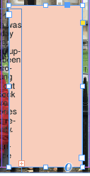
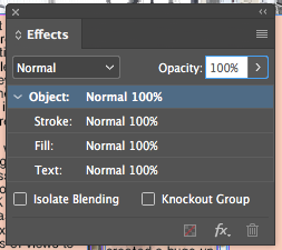
Below is the text box with 100% capacity.


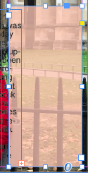
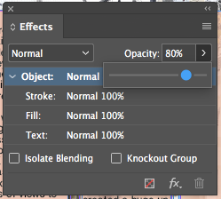
Below is the text box with 80% capacity.


I quite liked this effect as it not only followed codes and conventions of a double page spread, but it also showed more creativity by still being able to see the main image.

Saturday, 25 November 2017

Production - Documentary draft 2

Advanced Portfolio from grace page on Vimeo.

This is my second documentary draft after making some large changes.
I now have a new presenter, more suitable locations, more appropriate cutaways and better suited music.
This version is still not completed, however I feel that I have improved the quality of my documentary since my first draft due to me using a better quality camera (iPhone 7 rather than a 6) and my editing is much better as before it was fairly slow, whereas now the pace is much better and the different cutaways I feel work together better.
I have also changed where my extract is from. It is now at the start of the documentary, rather than part of the way through (as seen on my arc in a previous post).

Planning - flat plan of poster


This is the first flat plan of my poster.
I have made sure I follow the correct codes and conventions of a Channel 4 poster by including the logo, an appropriate picture, my presenter and boxes around the text. All of these are common conventions of a Channel 4 poster, which I have previously analysed.

Friday, 24 November 2017

Research - Audience Feedback Questionnaire

Click here to see my questionnaire I sent to my target demographic regarding the Channel 4 Logo, titles font throughout the Documentary and the photo for the poster.

Production - new contact sheet

I have decided to change my documentary quite a lot.
I have changed my central location to Westminster, London. This makes more sense due to my documentary being based on politics, so being filmed by the Houses of Parliament is much more suitable.
I have also used one of my friends to be my presenter. She is in casual clothing and a bright red coat, which is symbolic to stereotypical features of London such as the buses, flag and postboxes.
I have also filmed iconic places such as the River Thames and Houses of Parliament in order to make a link between the locations and the narrative.

Thursday, 23 November 2017

Research - music for documentary

In my first draft documentary, my music did not fit very well.
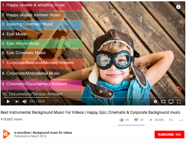
I therefore looked through many websites and YouTube channels.
I found this channel which had many different types of background music:


I went through all of the options and number 9 was exactly the music I thought would suit my style of documentary.

I had a look into copyright and other regulations, and on this channel it said the following:


I therefore downloaded it and have stated and credited from 'e-soundtrax'.

My Chosen Brief

7. An extract from an original documentary TV programme, lasting approximately five minutes, together with two of the following three opti...